Apart from the Catrice palette I showed you last week, I bought another matte, budgetproof eyeshadow palette a few weeks ago. This one is by MUA and plenty of people wanted to see how this eyeshadow palette holds up and especially how it compares to the Catrice one. And so here we are: with a review of another drugstore matte eyeshadow palette and an answer to the question: which is drugstore matte eyeshadow palette is better?

MUA Matte Ever After eyeshadow palette
I hadn’t read much about this palette anywhere yet. I heard plenty of good words about the other palette by MUA. Overall, the Undressed and Undressed 2 palettes get rave reviews. However, they are listed as dupes for the Naked 1 and 2 palettes by Urban Decay. Since I already own those, I’d never gone for any of the MUA palettes. But then I spotted this matte version (before I found the Catrice one) and decided to pick it up. At €5.99 is hardly breaks the bank, but it is one euro more expensive than the Catrice palette.

Packaging wise this palette is nothing but a simple, plastic case with a useless double-ended sponge tip brush. The fact that the lid is transparent does earn it bonus points. It shows you all the colors in one go and that is handy when you have more than one eyeshadow palette in your stash. In other words, clean and simple, but very practical packaging.
In total there are 10 shades in this palette. They seem to range from a creamy white, a yellow, two skin tone colors and some taupes and browns to two different dark grays. Looking at these colors they seem to be a mix of cool and warm tones but I am unsure of how well balanced the division between the two are. At first glance there seem to be more warm toned shades rather than cool toned shades.

The information on the back is straightforward. There is an ingredient list and the palette has a name: Ever After. And you should be able to create a natural and more out there eye look with this palette. There are no suggestions for making a look, but then again I think you should always use your own imagination.
The added bonus with this palette is that the shades come with names. I don’t know why, but having shade names always makes me happy. It just seems as if a little bit more thought was put into making the product and it’s always handy when referring to shades on your blog.

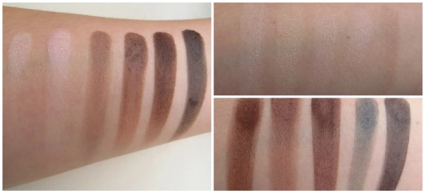
Top: Unwrap – Butter – Bare – Taffeta – Fade
Bottom: Penny – Chino – Truffle – Fog – Smoke
Let’s have a closer look at these shades. The top row consists of lighter shades and the bottow row seems to be darker, deeper shades. The question is of course, whether this is what you get.
- Unwrap: matte white
- Butter: matte soft yellow
- Bare: matte skin tone shade
- Taffeta: matte skin tone shade with more pink and a bit lighter than Bare
- Fade: light taupe shade which leans more brown
- Penny: greyish brown
- Chino: darker taupe shade which leans towards grey
- Truffle: deep reddish brown
- Fog: blue grey
- Smoke: charcoal grey color
In other words, you get 3 highlight shades, 4 all over lid shades, and 3 crease/ outer v/ liner shades. So much for the colors, let’s have a look at the texture and swatches below.

Unwrap – Butter – Bare – Taffeta – Fade

Penny – Chino – Truffle – Fog – Smoke
These shades are a little bit chalky as you can see when they are on my finger tips. Especially the light shades have a hard time showing up, but then again, I am fair skinned so they aren’t supposed to show up much. The light shades all seems to blend easily with my natural skin tone, which is why they all look very same-y. This especially goes for the two skin tone shades. They are so similar that the difference is barely there against my skin.
The darker shades have a better color pay off, but they also look a bit chalky. The darker taupe shade, Chino, and Fog both look a tad disappointing in the swatch, so I was curious to see how they would perform when I use them in an eye look. The swatches also show that this palette is overall cool toned. The only truly warm shades are Penny and Truffle. So far my favorite shades, based on the swatches are Fade, Taffeta, Penny and Truffle.

Eye look:
Fade: all over lid
Taffeta: brow bone highlight
Unwrap: inner corner highlight
Chino: crease & outer V
Liner: MAC Dark Diversion
These eyeshadows really apply a lot better than I had expected based on their swatches. The pigment is great or very easy to build up to something that is acceptable. The only shade that really didn’t show up was Unwrap. It’s that I know I applied it in my inner corner that I know it should be there, but when you look at the picture above, I cannot see it anywhere. In this look I was trying to go for something different from my usual look. So I went with a much darker Outer V that blended into the crease. I pulled out the crease color more than I usually would to have it line up with the wing of my eyeliner later on.
The only shade in the palette that I found difficult to come up with a good way to combine it into and eye look is Fog. The icy blue grey shade isn’t really my cup of tea to be honest. It’s too blue and doesn’t really seem to go with anything else in the palette. If I hadn’t used a different eyeliner for this look, I’d have used Penny or Truffle as an eyeliner for this look. Chino actually performs better than I had expected and was easy to blend and build up into my crease. Combined with Fade it can be a very good every day smokey eye color.

Full Face:
MAC Select Moisture Cover concealer in NW20
MAC Face & Body foundation in C1
Catrice All Matt Plus transparent powder
Benefit Coralista blush
Maybelline The Falsies Flared mascara
Too Faced Shadow Insurance
Catrice Brow Definer in 020 flASHy brows
Catrice Eyebrow filler in 020
YSL Rouge pur Couture The Mats lipstick in 207 Rose Perfecto

All in all, this is a good eyeshadow palette. Some of the colors aren’t great. Fog and Unwrap I personally could do without. Some of the colors surprised me: Fade and Chino. The palette is varied enough to make some great every day looks. And with the well-pigmented darker shades it will be easy enough to pull a day look into night and glam it up a little bit. Just put lots of Smoke along the lashline and you’re done! But wait! That’s not all. I promised to compare this to the Catrice palette so here it goes.

Packaging wise both palette score equal points: they are both made of a cheap plastic and come with a cheap brush. MUA has 10 shades whereas Catrice has only 6. That is 4 more shades. However, in the MUA palette, there are at least 2 – 4 shades (Butter, Fog, Bare, and Unwrap) that I will not use or will not reach for much because they are not my cup of tea, are too similar to something already in the palette or do not perform well. So this one goes to Catrice, as I will definitely be using all 6 shades. Lastly, let’s look at the price. MUA’s palette is €5.99 and Catrice’s costs €4.99. I again say that’s a tie, because with MUA you do get more shades and a bigger variety to play with.
The score after round 1: MUA 2 – Catrice 3.
Left, Catrice; right, MUA
Moving on to swatches, texture and pigmentation. And here I have to give Catrice the winning points. The eyeshadows are creamy and buttery soft, whereas MUA’s formulation is slightly chalkier. The shade selection in MUA is better though. There is a variety of both warm and cool tones, whereas Catrice only gives you cool tones. However, whether you really need 3 highlight shades is another thing, but in the end, the MUA palette offers you more variation between dark, medium and light shades, which means more potential to create looks.
The score after round 2: MUA 3 – Catrice 4.

Left, Catrice; right, MUA
Finally, let’s have a look at round 3: overall performance on the lid. To serve the purpose of a decent comparison I put the two looks I created for the reviews beside one another. I like the look of the Catrice shadows better on my eyes. But when it comes to how these apply I’d have to say and if I have to be very critical, I’d have to go with MUA here though. Because the shadows are a bit on the chalky side you can easily build them up and while they still blend out easily you don’t blend away the color completely. The Catrice shadows, be it soft and buttery smooth, have the downside that you can easily blend them away. The MUA ones definitely do not. So even though the Catrice look may look better in the picture above, I have to give points to MUA for creating shades that not only apply easily but also stay put.
The score after round 3: MUA 4 – Catrice 4.

So there you have it: each palette has its pros and cons. At first glance the Catrice palette seems to be the better one, but the biggest disadvantage is the fact that it’s easy to overblend the shades. Whereas the MUA doesn’t have the initial WOW-this-is-blowing-me-away factor, it is still a great palette that offers you a bigger variety of shades and mixture of both cool and warm tones. However, whether you use all the shades offered is personal taste and that’s why I think either one of these is a good choice to go with. It all depends what is available to you and whether you like having only cool toned shades or not. If your place sells Catrice and you like cool tones: go for Catrice. If your place sells MUA and you are in for some warm toned eye looks: go for MUA.
Which palette is your favorite?


Leave a Reply