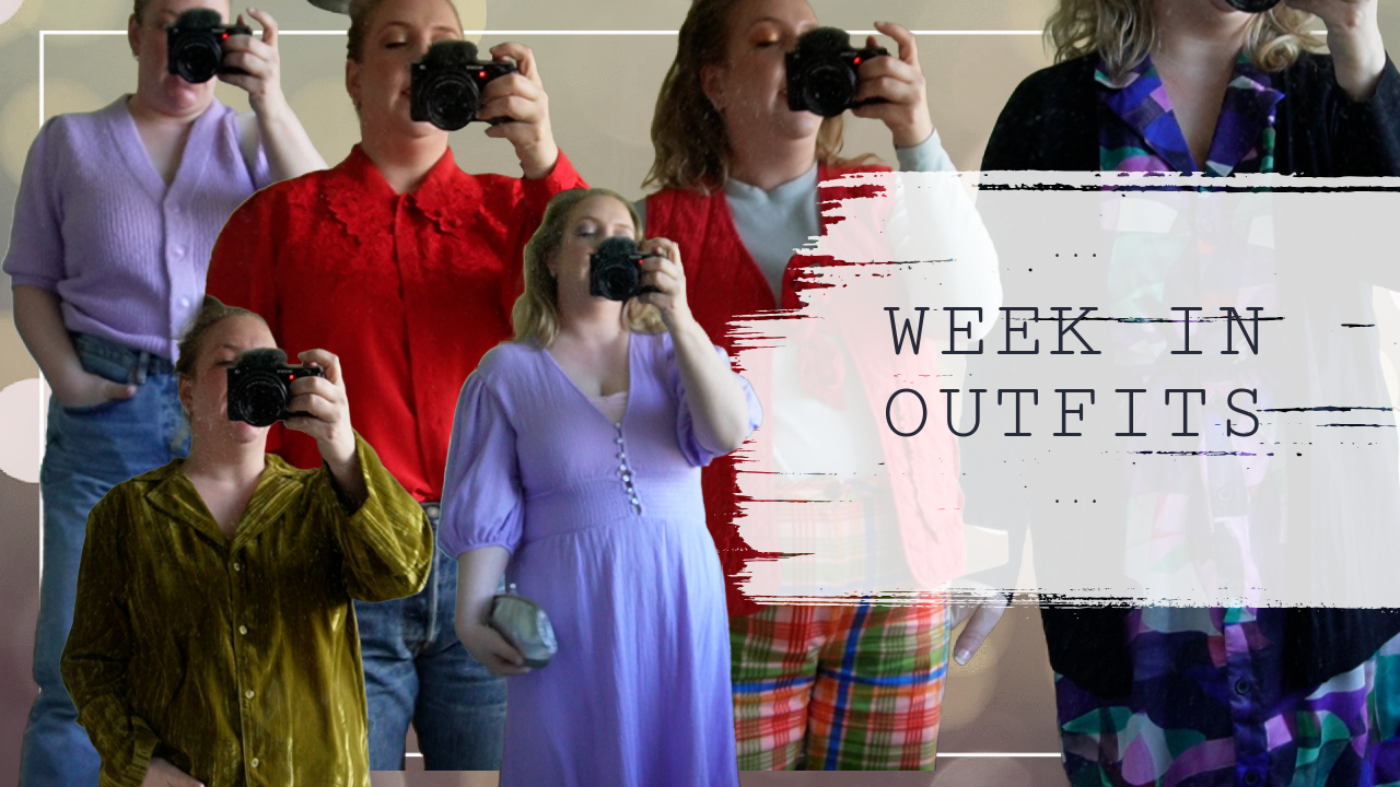
It’s Fashion Friday which means it’s time for another look at some fun spring outfits. Right here in The Netherlands, the past couple of weeks have been rather cold and dreary but as of yesterday the weather has been improving a bit so let’s just hope we keep that going so some of the outfits I’m showing you today will become more appropriate. Today’s theme is ‘dare to print’. I love wearing prints for spring time, but for today’s post I went the extra mile and put together some more in your face outfits of which I’m not sure whether I would wear them out. In any case, some of these outfits are not fit for work, but I just wanted to have some fun and see what would and what wouldn’t work. Am I satisfied and over the moon about all these outfits? No. But I do believe that fashion is about having fun and taking risks. Whether something works, is all a matter of personal taste in the end.

1.) Casual stripes


Striped blouse (H&M)
Jaimy jeans in denim blue (Topshop)
Low top allstars in black (Converse)
Rainbow mirrored sunglasses (Six)
The most easy way to wear a print it by keeping one part of your outfit print free. Here I paired a classic stripy blouse in a baggy oversized cut with tightfitted highwaisted skinny jeans in a classic denim blue. You could tie the blouse into a 90s knot, but I went with a simple half tuck so I would retain my shape. To add to the comfort of this outfit I finished off the look with my well worn converse sneakers that have been almost everywhere I have been in the 5 or so years I’ve had them. I added the sunglasses for a hint of color, as the outfit was fairly same-y in the overall color scheme.
2.) In your face floral


Button down floral print blouse (Mink Pink via Urban Outfitters)
Black floral print trousers (H&M)Pink faux suede heel (Van Haren)
BOOM! And this is what I meant when I said that I was going to take some risk with some of these outfits. Another way to wear prints is to put prints together. You can do that in several ways. Here I went with floral on top and floral on the bottom. The reason why it works in my opinion is because the two floral patterns are different color schemes that complement each other rather than clash. To balance out the busy print combination, I opted for no accessories and wore a pair of pale pink pumps that closely match my skin tone. Would I wear this to work? No. I think I’d blind my poor students or make them dizzy as this print combination borders on psychedelic.
3.) Yellow cab


Gingham print smock dress (The White Pepper via Asos)
Yellow lace cardigan (Vila)
Yellow flats with braided detail (New Yorker)
Shamrock necklace (random souvenir shop in Dublin)
Quite possibly my favorite outfit out of these 5! The minute I saw this gingham print dress I fell in love. Gingham print gives any item and immediate retro feel and the same goes for this smock dress. When it comes to black & white prints, I love pairing them with brighter colors. Although yellow isn’t my first choice (I’m more of a blue or red girl), I think the brightness of this color just screams spring. To finish things off I went with a dainty necklace. I think it adds something extra girly and cute to this already cute and girly outfit.
4.) Checks & sports


White & black window pane shirt with contrast collar (Primark)
Black & white checked trousers (H&M)Blue & orange Roshe Run sneakers (Nike)
Polka dot sunglasses (Forever 21)
One trend this spring/ summer season is to mix more dressy items with sportier ones. I’m still trying to figure out how to make this trend work for me as I really like it. For this outfit I combined two very dressy items in clashing monochrome prints with a pair of Nike Roshe Run sneakers. There is just something about monochrome prints that I love and I think the white & black vs black & white clash works really well. However, it is not as dressed up clashed with dressed down as I would like it to be. Still maybe I should have gone with a heel in a fun color instead of the sneakers to make the outfit work better.
5.) Feed the birds


Black & white polka dot sleeveless blouse (H&M)
White & black swallow print dress (H&M)
Black mary jane block heels with plateau (H&M)
Spiky necklace (H&M)
Hahaha, just now as I’m typing this up, I realize that this entire outfit features solely H&M items. Well, what can I say, I love me some H&M. This is an outfit that only works if temperatures start to rise pronto, but I wanted to add something a bit more warm weather appropriate as well. Again I’m clashing monochrome prints (dark on top, lighter on the bottom this time), but rather than using graphic prints like in the outfit above, this one features a more frivolous print. I think that clashing a black and white print with one half black and one half white (regardless whether it is your top or bottom half) is the best way of wearing double prints. Instead of wearing a pop of color in an accessory, I think the paleness of my legs makes up for that. They don’t tan. Not ever. Not even if I try. So I gave up years ago, but I like my legs too much to not put them on display during warmer weather.
Which outfit is your favorite?


Leave a Reply to MyrtheCancel reply