Lately, I’ve seen many reviews pop up with products from a new budget brand: Make Up Revolution. I was lucky to find the stand of this brand at a Superdrug when I was in London last month. From everything that was on offer, I decided to pick up the Flawless 32 Ultra Professional eyeshadow palette. This is a 32 pan eyeshadow palette that features neutral shades and a few pops of color. The way the colors looked on the back of the palette reminded me of a fusion of all 3 Naked palettes by Urban Decay. And it only cost 8 or 9 pounds. So I thought: why not give it a shot.
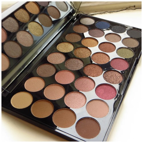
Make Up Revolution Flawless eyeshadow palette
I first saw this brand with the Pixiwoo sisters and by now many other bloggers are discovering the brand. I have not seen anyone review this palette though. I am not sure whether it is widely available. If you’re in the UK, you will be able to find this at your local Superdrug I’m sure. If you’re anywhere else in the world then check whether any online stores stock the brand.


The packaging is a sleek but simple looking plastic case. The lid features a gigantic mirror and no applicator is included. The way many of the eyeshadows from this brand look, reminds me a lot of Sleek and I have a feeling that the brand may be affiliated to the company. However, that is nothing but a hunch. In any case, Sleek eyeshadows are usually pretty good, so I had good hopes for this palette.

The shades were shown on the back of the packaging and that’s what I went on when I bought this product. There was no tester available and of all the different palettes, this one seemed the most interesting to me. Make Up Revolution also do dupes of the Urban Decay Naked 2 and 3 palettes and the Too Faced Chocolate Bar palettes. And at first glance these shadows seem to be a mix of cool and warm shadows as well as a few rosy shades with a few colors thrown in for variation. Unfortunately the shades on the back weren’t really a good preparation for what was really inside.

These are all 32 shades laid out. The colors are a lot more apparent than on the back of the packaging, which is a plus. The top row is mostly cool toned with a few highlighters. Then on the most vertical left column, there are a few matte brown. Then there’s a block of rosy/ pink shades with what looks like a good cranberry shade. Some warmer shades follow with some shimmery dark browns and bronzes. But also there is what seems like a taupe with a purple undertone and a true taupe in the second and third row on the right. The odd ones out are the reds, greens and dark blue, but those could add an interesting pop of color in an otherwise neutral palette. The last two shades are a shimmery and a solid black color. In other words: this looks like a fun, neutral, yet versatile palette.


Let’s look at all the shades. I grouped 8 shades together at a time. The first block consists of the 8 shades in the top left corner of the palette.

- Paper: matte creamy light yellow
- Soft glow: matte beige nude
- Buff: shimmery light taupe
- Highlite: shimmery rosy champagne
- Almost there: matte soft brown
- Uncover: matte rosy nude
- Barely pink: light pink shade with a hint of shimmer
- Lowlite: shimmery medium brown

- Angel: shimmery golden champagne
- Unlimited: shimmery light bronze
- Brew: shimmery tan
- Silver smoke: shimmery silver grey
- Golden night: shimmery gold
- Gold digger: shimmery bronze
- Cheerless: shimmery mauve taupe
- Blue stars: shimmery navy blue
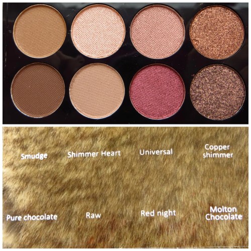
- Smudge: matte medium brown
- Shimmer heart: shimmery rosy pink
- Universal: shimmery dusty rose
- Copper shimmer: shimmery copper
- Pure chocolate: matte dark brown
- Raw: matte beige
- Red Night: shimmery cranberry
- Molton chocolate: shimmery deep dark brown

- Medal: shimmery coppery bronze
- Darkest shimmer: shimmery dark brown
- Tarnish: shimmery dark taupe
- Black tie: black with silver shimmer
- Burgandy nights: deeper shimmery cranberry shade
- Green stars: deep shimmery forest green
- Café noir: shimmery brown/ green
- Night: matte black
It’s a good array of colors, but some of them are fairly similar to one another already in the pan. They look different in the swatch, but I found that when I use them on the eyes, all those different coppers, bronzes and browns melt into one. The colors are just a tad too similar. But this is still a very workable palette. You just need to make sure that you make sure you don’t mix any colors that are too close together.

Paper, Soft glow, Buff, Highlite, Angel, Unlimited, Brew, Silver smoke
Almost there, Uncover, Barely pink, Lowlite, Golden night, Gold digger, Cheerless, Blue stars

Smudge, Shimmer heart, Universal, Copper shimmer, Medal, Darkest shimmer, Tarnish, Black tie
Pure chocolate, Raw, Red Night, Molton chocolate, Burgandy nights, Green stars, Café noir, Night
Another problem I found with this palette, is that the colors look different in the swatch than in the pan (let alone in the picture on the back). Where Unlimited (in the top row) looks like a light taupe with a bronze undertone in the pan, it is in fact much deeper and darker than it seems. It doesn’t look that different from Tarnish, a few rows down, which again doesn’t look too different from Café Noir. Yet all these shades look very distinct in the pan.
Then there are also a few shades that don’t perform well. Paper is barely visible and the only real highlight shade in the palette, together with soft glow. Pretty much all the light matte shades go on quite difficult and some of the lighter shades look quite chalky or disappear against my skin. Blue stars looks so amazing in the pan, but in the swatch it’s nothing but a swatch of dark with a hint of blue shimmer.
Of course, there are also some awesome shades in here. The deep forest green of Green stars is absolutely stunning. As well as Molton Chocolate, Copper shimmer and Lowlite. The shades that have the seemingly grainiest texture in the pan go on the smoothest on the arm and eye. The cranberry and taupe shades are also gorgeous and it also has a nice range of golds and bronzes that I love using in summer and fall. The fact that this palette has a decent medium and dark matte brown is another bonus point.
I found that the best way to use this palette, is not by looking at the palette itself, but at the swatches first. And that is a bit too much of a hassle at times. Plus instead of 32 distinct shades, you don’t really get that many, as so many color simply bleed into one another on the eye as well. However, I did manage to make not one but 3 different eye looks with this palette. The first look is a darker neutral look. The second a rosy neutral one. And finally I played around with that forest green.
Look 1: dark neutral

Soft glow = brow highlight
Buff = crease
Raw = crease to blend
Tarnish = all over lid
Copper shimmer = lower lash
Molton Chocolate = liner & outer third lower lash
Highlite = inner corner

MAC Face & Body in C1
MAC Select Moisture Cover in NW20
Catrice All Matt Plus powder in transparent
Catrice brow definer & gel
Hourglass blush in Diffused Heat
MAC pink plaid & lip erase
L’Oreal butterfly mascara
TBS Honey bronzer in 02 fair matte
Look 2: rosy neutral

Lowlite = outer v
Paper = browbone & inner corner
Universal = all over lid
Almost there = crease
Cheerless = lower lashline & liner

MAC Face & Body in C1
MAC Select Moisture Cover in NW20
Catrice All Matt Plus powder in transparent
Catrice brow definer & gel
MAC At Dusk Extra Dimension blush
Pink strip from Too Faced Snow Bunny bronzer as highlight
Topshop Armour lipstick
L’Oreal butterfly mascara
Look 3: smokey forest green

Buff = lid
Green stars = outer v
Unlimited = crease
Paper = brow bone & inner corner

Diorskin Nude foundation in 010 Ivory
Catrice Velvet finish concealer in 020 velvet rose
Maybelline master precise eyeliner in forest brown
L’Oreal butterfly mascara
Too Faced shadow insurance
Catrice brow definer & gel
Rimmel Apocalips lip velvet matte 307 meteoric matte
The Balm Mary Louminizer
NARS LagunA
Catrice All Matt Plus powder in transparent
Rival de Loupe Young Mono Rouge 03 Pink Grapefruit
All in all, I like this palette, but I don’t love it. For the money you pay you get a few absolutely gorgeous shades that I think are worth the amount you pay for the entire palette. However, some of the shades are too similar, nothing like what they seem to be when looking at the pan or they don’t perform very well. But let’s be fair: this palette has some great pigmentation and it’s not as if you can’t do a decent make up look with this. You can, you just need to make some swatches on your arm before you start.
In short, this is a great palette to add to your stash if you’re looking for a nude or neutral eyeshadow palette that can do everything in one go. Just bare in mind that this palette takes some getting used to.
What is your favorite neutral eyeshadow palette?


Leave a Reply to fleureroseCancel reply